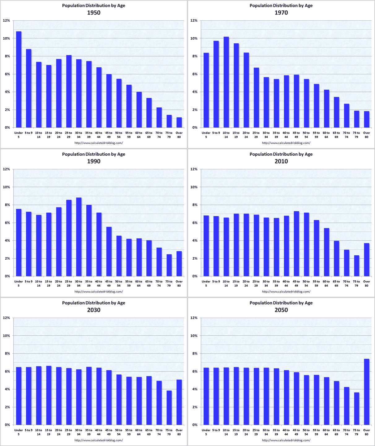
this shows why social security is in trouble
This animated chart shows the change in the age distribution of the U.S. between 1950 and 2050:
Found here.
This is devoted to my random thoughts...about anything. Originally I limited myself to those thoughts having something even remotely to do with biblically-based, Christ-centered principles of personal financial management. But now I often don't....
This animated chart shows the change in the age distribution of the U.S. between 1950 and 2050:
Found here.
Posted by
RB
at
10:06 PM





No comments:
Post a Comment